Alerts and Messages is an integral part in any Vuejs application, in this article i will demonstrate how to display toast messages and alerts in vuejs framework.
To display toast messages in vuejs we will use vue-toastr plugin, you can find it in github.
Toastr Installation
To use toastr directly in browser via cdn:
<script src="https://unpkg.com/vue/dist/vue.js"></script>
<script src="https://unpkg.com/vue-toastr/dist/vue-toastr.umd.min.js"></script>
To install with npm
npm install vue-toastr
To install with yarn
yarn add vue-toastr
Importing and Using Toastr
To use vue-toastr as a plugin you have to import and use it like this:
import Vue from "vue";
import App from "./App.vue";

// import plugin
import VueToastr from "vue-toastr";

// use plugin
Vue.use(VueToastr);
Then you have two choices whether to use as a plugin or as a component:
Using Vue-Toastr as a Plugin
To use vue-toastr as a plugin you have to import and use it like this:
import Vue from "vue";
import App from "./App.vue";

// import plugin
import VueToastr from "vue-toastr";

// use plugin
Vue.use(VueToastr, {
  /* OverWrite Plugin Options if you need */
});

new Vue({
  render: h => h(App),
  mounted() {

    // then you can call toastr
    this.$toastr.s(
      "Hello world"
    );
  }
}).$mount("#app");
Then you can access $toastr instance in any component like this:
<template>
        <div>
            <a href="#" v-on:click.prevent="showSuccessToast">Display toast</a>
        </div>
</template>

<script>
      export default {
            methods: {
                 showSuccessToast() {
                    this.$toastr.s("Success", "Hello world");
                 }
            }
      }
</script>
Using Vue-Toastr as a Component
<div id="#app">
  <!-- Your vue application -->
  <vue-toastr ref="mytoast"></vue-toastr>
</div>


import Vue from "vue";
import App from "./App.vue";

// import plugin
import VueToastr from "vue-toastr";

// register component
Vue.component("vue-toastr", VueToastr);

new Vue({
  render: h => h(App),
  components: {
    // "vue-toastr": VueToastr,
    // VueToastr,
  },
  mounted() {

    this.$refs.mytoast.s(
      "Hello world"
    );
  }
}).$mount("#app");
Creating Toast
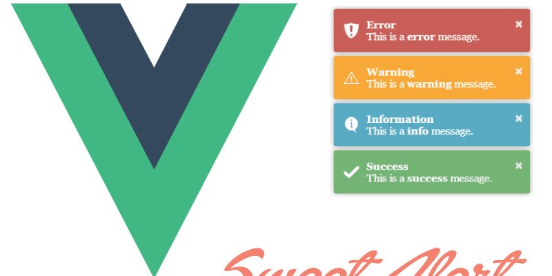
To display a toast message vue-toast provides a variety of methods of different scenarios such as success or errors:
this.$toastr.s("SUCCESS MESSAGE", "Success Toast Title");
this.$toastr.e("ERRROR MESSAGE");
this.$toastr.w("WARNING MESSAGE");
this.$toastr.i("INFORMATION MESSAGE");
In addition to these methods vue-toast provides the Add method which gives you more control over toast display:
this.$toastr.Add({
  name: "UniqueToastName",

  title: "Success", // Toast Title

  msg: "Operation done successfully", // Toast Message

  clickClose: false, // Click Close Disable

  timeout: 0, // Remember defaultTimeout is 5 sec.(5000) in this case the toast won't close automatically

  position: "toast-top-full-width", // Toast Position.

  type: "success", // Toast type,

  style: { backgroundColor: "blue", width: "150px" }
});
Removing Toast
It’s supposed that toast messages closed automatically after some seconds but you can explicitly call some helper methods to remove toast.
this.$toastr.Close(toast instance); // remove toast
this.$toastr.removeByName("UniqName"); // remove toast by name
this.$toastr.removeByType("error");
For more details about vue-toast take a look at the docs.
Display Swal Messages in Vue-js
The second plugin in this tutorial is vue-swal, this is a wrapper of the Sweet Alert javascript plugin.
Installation
To install with npm
npm install vue-swal
To install with yarn
yarn add vue-swal
Usage
import Vue from 'vue'
import VueSwal from 'vue-swal'

Vue.use(VueSwal)
App.vue
export default {
  methods: {
    alert() {
      this.$swal('Hello word!')
    }
  }
}
Examples:
– Text
export default {
  methods: {
    alert() {
      this.$swal({
         text: "Hello world!",
      });
    }
  }
}
- Title
export default {
  methods: {
    alert() {
      this.$swal({
         title: "Hello world!",
      });
    }
  }
}
With icon:
icons such as “success”, “error”, “warning”,”info”
export default {
  methods: {
    alert() {
      this.$swal({
         icon: "success"
      });
    }
  }
}
Button
export default {
  methods: {
    alert() {
      this.$swal({
         icon: "success",
         button: {
            {
               text: "OK",
               value: true,
               visible: true,
               className: "",
               closeModal: true,
             }
         }
      });
    }
  }
}
Buttons
export default {
  methods: {
    alert() {
      this.$swal({
         icon: "success",
         buttons: {
            cancel: {
    text: "Cancel",
    value: null,
    visible: false,
    className: "",
    closeModal: true,
  },
  confirm: {
    text: "OK",
    value: true,
    visible: true,
    className: "",
    closeModal: true
  }
         }
      });
    }
  }
}
For the full list of the available options and examples refer to SweetAlert docs.