Web components is a new technology that allows to create reusable custom html elements and complex components that has a separate markup, in this post we will look at web components and how to create such components in javascript.
Long time ago creating a custom html elements was not so easy for example when we need to create some widget that consists of a title, description and image, the traditional way is to create a <div> which contains an <h2> that represent the title, <p> element that contains the description, <img> element that contains the image like so:
<div>
   <h2>The Title</h2>
   <p>Description</p>
   <img src="" />
</div>
Now consider that we need to use this widget in multiple places, we will do this by repeat this code over and over in the desired places. As you see this isn’t the optimal solution. Web components comes to overcome those problems by defining this widget once, then we can reuse it.
The Shadow DOM
A new concept comes with web components that some browsers support it which is the Shadow DOM. The Shadow DOM is the same as Real DOM but when rendered in a web page it’s hidden, this is why it’s named Shadow. There are already built in html elements that has Shadow DOM build in their internal structure some examples include <video> and <audio> elements.
For example let’s inspect this code snippet which contains this <video> tag:
<!DOCTYPE html>
<html>
<head>
	<title>shadow dom</title>
</head>
<body>

      <video width="320" height="240" controls>
  		<source src="movie.mp4" type="video/mp4">
  		<source src="movie.ogg" type="video/ogg">
			Your browser does not support the video tag.
	  </video>

</body>
</html>
Open this code in Chrome, then right click to inspect the element as shown:

The shadow DOM is hidden be default, to display it go to developer settings as shown:
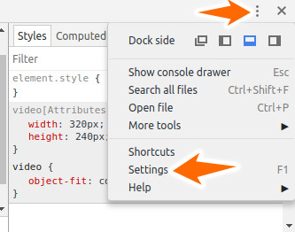
Next check this button “Show user agent shadow DOM”

Reload the page and inspect the video element again you will see this complex html known as the shadow DOM:

As you see this is the shadow DOM tree for the <video> element, there also other many built in html elements that built with shadow DOM tree. So let’s understand some concepts related to shadow DOM in the next section and how to create a custom shadow DOM element.
Shadow DOM Architecture
The idea behind shadow DOM is encapsulation so to keep the markup, structure, style and behavior hidden and separate from the source code of the page so that other parts don’t crash and source code be kept nice and clean.
To illustrate this is will use the below diagram taken from the above example which i applied it to the <video> element.
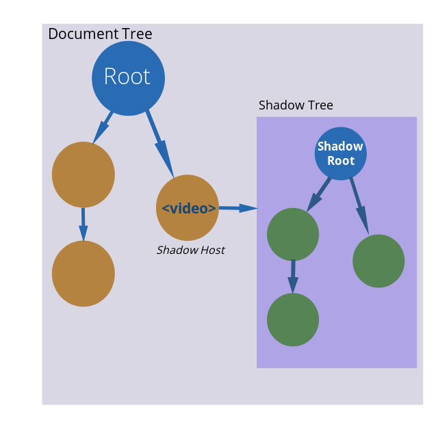
As you see in this diagram shadow DOM is now clear to you but let’s clarify some terminologies in the diagram:
- Document Tree: This is the entire page dom which begins by opening the <html> tag, <head>, <body>. The document tree can hold other nested elements as well as elements that contain shadow DOM as you see above the <video> element.
- Shadow Host: This is the element that the shadow DOM attached to in this example the <video> element.
- Shadow Tree: This is the same as the document tree and contain other nested elements but it’s by default hidden and can be shown by toggling browser settings. The shadow tree also have a root element which all other elements belong to.
- Shadow Root: The root node of the shadow tree. This is the only item that appears on the page in this case the <video> element is the shadow root and all other elements that descendant from is hidden by default.
Keep in mind that the shadow dom contain normal html elements, those elements can contain also nested shadow DOMs.
Shadow DOM Usage
You can Element.attachShadow() function to attach a shadow root to any element. The method takes options parameter which specifies the mode of ‘open’ or ‘closed’.
let shadow = elementRef.attachShadow({mode: 'open'});
let shadow = elementRef.attachShadow({mode: 'closed'});
When the mode is set to ‘open’ then we can access the elements of the shadow root from javascript. If the mode set to ‘closed’ we can’t access elements of the shadow root and it return null. This behavior is useful to prevent access to custom elements for security reasons.
Let’s see an example where we set a shadow root to this <article> element below:
<!DOCTYPE html>
<html>
<head>
	<title>shadow dom</title>
</head>
<body>

	  <article id="my-article">
	  	Lorem ipsum dolor sit amet, consectetur adipisicing elit. Quas nesciunt, facilis laudantium. Quo, dolore dolor soluta? Nemo, quis, suscipit. Ratione dolores, impedit tempora odio voluptatibus molestias totam voluptatum maxime minima!
	  </article>

	  <script>
	  	let elementRef = document.getElementById("my-article");

	  	let shadow = elementRef.attachShadow({mode: 'open'});

	  	console.log(elementRef.shadowRoot);  // return #shadow-root(open)
	  </script>

</body>
</html>
Note that when running this example the <article> show on rendered page as this is the default behavior of shadow DOM, but we will use this in the next section when creating custom elements.
When calling elementRef.shadowRoot return a reference to the shadow root object which is #shadow-root(open), now if we update the mode to ‘closed’ like this:
let shadow = elementRef.attachShadow({mode: 'closed'});

console.log(elementRef.shadowRoot);   // return null
Shadow Root Can Be Applied To These Elements
<article><aside><blockquote><body><div><footer><h1><h2><h3><h4><h5><h6><header><main><nav><p><section><span>- Any custom element
What about attaching a shadow root to an element that is already has shadow root. Let’s see this in action in this example:
<video width="320" height="240" controls id="my-video">
  		<source src="movie.mp4" type="video/mp4">
  		<source src="movie.ogg" type="video/ogg">
			Your browser does not support the video tag.
	  </video>

	  <script>
	  	let elementRef = document.getElementById("my-video");

	  	let shadow = elementRef.attachShadow({mode: 'open'});

	  	console.log(elementRef.shadowRoot);
	  </script>
When running this example it won’t run and an Invalid State Exception occurs to elements already has shadow DOM.
Now after you understand the shadow DOM let’s move on to apply this when creating custom elements.
Creating Custom Elements
Creation of custom elements become available in latest versions of Ecmascript with the use of special interface CustomElementRegistery interface, where we use CustomElementRegistery.define() method which accept two mandatory parameters:
- A DOMString representing the tag name of the custom element. Note that custom elements must be written with (kebab-case) with dash to separate tag names.
- A class object that defines the functionality of that element
- The function also accept an optional parameter that specifies the extends property in this case the class must extend from the specified html object to implement it.
To see this in action we need to setup some things, first as we will deal with Ecmascript 6 classes we need away to transpile the code into ES5 code that all browsers support it as classes not supported by all major browsers, we can use something like webpack or gulp but for simplicity we will use a special npm package called Rollupjs.
Note that this example need to be run using http:// protocol not file:// protocol in order to work properly, in my case i use apache web server but you can use any server you want.
Install Rollup globally using this command:
npm install --global rollup
Next prepare a new folder with this structure:
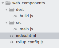
- src: Contains Es6 code. In this case i added a single file main.js, this file where we write our Es6 code.
- dest: Contain compiled code after we build it with rollup. build.js will be created automatically after each build.
- rollup.config.js: This is rollup configuration file that defines the input js files and the output file locations.
Open rollup.config.js and add this code:
export default {
	input: 'src/main.js',
	output: {
		file: 'dest/build.js',
		format: 'iife'
	}
};
Then inside your project open terminal after each update to main.js compile the file with:
rollup -c
This will compile src/main.js to dest/build.js
index.html
<!DOCTYPE html>
<html>
<head>
	<title>creating custom elements</title>
</head>
<body>


	  <script src="dest/build.js"></script>

</body>
</html>
As you see above we added dest/build.js as this the compiled code that browsers can render.
In this example i want to create a custom item that represent a comment item that contains some kind of avatar, username and comment text. Before creating custom element let’s imagine the resulting output so for this example this is i came with:
<div class="comment-item">
      <img class="comment-avatar" src="">
      <div class="comment-user-bio">
          <h4>User name</h4>
          <p>Just another comment</p>
      </div>
</div>
Our class must produce the above html component, so let’s open main.js and begin by adding this code:
class CommentItem extends HTMLElement {

      constructor() {
          super();
      }
}
This is the syntax of Ecmascript 6 classes, when creating custom elements the class needs to extend from HTMLElement. In the constructor i invoked super() function to call the super class constructor. Inside the constructor add this code snippet:
                                // Create a shadow root
				var shadow = this.attachShadow({mode: 'open'});

				// Create component dom
				var container = document.createElement('div');
				container.setAttribute('class','comment-item');

				var avatar_item = document.createElement('img');
				avatar_item.setAttribute('class','comment-avatar');

				var comment_bio_container = document.createElement('div');
				comment_bio_container.setAttribute('class','comment-user-bio');

				var comment_username_item = document.createElement('h4');
				var comment_text_item = document.createElement('p');
At first i created a shadow root using this.attachShadow() function as we saw above, note that ‘this’ refers to the current element in this case CommentItem. The reset of the code is a normal dom manipulation which i created a container and assigned a class of ‘comment-item‘. Then i created an img element and assigned class ‘comment-avatar‘, the other elements created the same way.
As a rule of thumb the class names of custom elements should describe the comment name and should be separated with dash to prevent them from interfere with other page classes.
Next let’s bind dynamic values from attributes so add this code right after var comment_text_item=document.createElement(‘p’).
                                // Bind attribute values
				var avatar = this.getAttribute('avatar');
				avatar_item.setAttribute('src', avatar);

				var username = this.getAttribute('username');
				comment_username_item.textContent = username;

				var comment_text = this.getAttribute('comment_text');
				comment_text_item.textContent = comment_text;
I used html function getAttribute() to get attribute value, so i called it to get avatar, the username and the comment text.
Next we need that our custom component to contain some styling, custom components provides this and can contain an internal or external style so let’s add some internal styles, add this code after comment_text_item.textContent:
// Create some styles
				var style = document.createElement('style');

				style.textContent = `
                                .comment-item {
                                	display: flex;
                                }
				                .comment-item .comment-avatar {
								    border: 1px solid #F0F2F8;
								    display: inline-block;
								    float: left;
								    height: 85px;
								    width: 84px;
								}
								.comment-item .comment-user-bio {
								    float: left;
								    font-size: 14px;
								    margin: -7px 0 0 20px;
								    width: 454px;
								}
								.comment-item .comment-user-bio h4 {
								    font-size: 18px;
								    font-weight: normal;
								    margin: 0 0 5px;
								}`;
The last piece is to append the created element and style to the shadow dom:
// attach the created elements to the shadow dom

shadow.appendChild(style);
shadow.appendChild(container);
container.appendChild(avatar_item);
container.appendChild(comment_bio_container);
comment_bio_container.appendChild(comment_username_item);
comment_bio_container.appendChild(comment_text_item);
To append the container to the shadow dom we use shadow.appendChild() as a normal html element, i do the same thing also for style. Then i append the child elements like avatar_item and comment_bio to the container, now all items connected to their parent container and the parent container connected to shadow root.
The Complete Code
main.js
class CommentItem extends HTMLElement {

	  		constructor(){
	  			super();

	  			// Create a shadow root
				var shadow = this.attachShadow({mode: 'open'});

				// Create component dom
				var container = document.createElement('div');
				container.setAttribute('class','comment-item');

				var avatar_item = document.createElement('img');
				avatar_item.setAttribute('class','comment-avatar');

				var comment_bio_container = document.createElement('div');
				comment_bio_container.setAttribute('class','comment-user-bio');

				var comment_username_item = document.createElement('h4');
				var comment_text_item = document.createElement('p');

				// Bind attribute values
				var avatar = this.getAttribute('avatar');
				avatar_item.setAttribute('src', avatar);

				var username = this.getAttribute('username');
				comment_username_item.textContent = username;

				var comment_text = this.getAttribute('comment_text');
				comment_text_item.textContent = comment_text;

				// Create some styles
				var style = document.createElement('style');

				style.textContent = `
                                .comment-item {
                                	display: flex;
                                }
				                .comment-item .comment-avatar {
								    border: 1px solid #F0F2F8;
								    display: inline-block;
								    float: left;
								    height: 85px;
								    width: 84px;
								}
								.comment-item .comment-user-bio {
								    float: left;
								    font-size: 14px;
								    margin: -7px 0 0 20px;
								    width: 454px;
								}
								.comment-item .comment-user-bio h4 {
								    font-size: 18px;
								    font-weight: normal;
								    margin: 0 0 5px;
								}`;


							// attach the created elements to the shadow dom

							shadow.appendChild(style);
							shadow.appendChild(container);
							container.appendChild(avatar_item);
							container.appendChild(comment_bio_container);
							comment_bio_container.appendChild(comment_username_item);
							comment_bio_container.appendChild(comment_text_item);
	}
}

customElements.define('comment-item', CommentItem);
Notice that i called customElements.define() passing the component name and the class. This is important to register the component as an element.
Now run this command to build:
rollup -c
To use the newly created component like so:
<comment-item avatar="https://www.gravatar.com/avatar/00000000000000000000000000000000?d=mp&f=y" username="John Smith" comment_text="Just another comment"></comment-item>
index.html
<!DOCTYPE html>
<html>
<head>
	<title>shadow dom</title>
</head>
<body>

    <comment-item avatar="https://www.gravatar.com/avatar/00000000000000000000000000000000?d=mp&f=y" username="John Smith" comment_text="Just another comment"></comment-item>

    <comment-item avatar="https://www.gravatar.com/avatar/00000000000000000000000000000000?d=mp&f=y" username="John Smith" comment_text="Just another comment"></comment-item>

    <comment-item avatar="https://www.gravatar.com/avatar/00000000000000000000000000000000?d=mp&f=y" username="John Smith" comment_text="Just another comment"></comment-item>


	  <script src="dest/build.js">
	  </script>

</body>
</html>
Great now we created a custom component like you see in frameworks like Angular or Reactjs.
Extended Example: Comment List
Let’s see another example which we will create a custom web component for comment list, in fact i will make use of the comment item component we just created above, this gives you a deep understanding of how to nest multiple custom components inside each other.
First refactor the comment item component to be in separate file. In the src/ folder create comment-item.js
src/comment-item.js
export default class CommentItem extends HTMLElement {

	 constructor(){
  			super();

  			// Create a shadow root
			var shadow = this.attachShadow({mode: 'open'});

			// Create component dom
			var container = document.createElement('div');
			container.setAttribute('class','comment-item');

			var avatar_item = document.createElement('img');
			avatar_item.setAttribute('class','comment-avatar');

			var comment_bio_container = document.createElement('div');
			comment_bio_container.setAttribute('class','comment-user-bio');

			var comment_username_item = document.createElement('h4');
			var comment_text_item = document.createElement('p');

			// Bind attribute values
			var avatar = this.getAttribute('avatar');
			avatar_item.setAttribute('src', avatar);

			var username = this.getAttribute('username');
			comment_username_item.textContent = username;

			var comment_text = this.getAttribute('comment_text');
			comment_text_item.textContent = comment_text;

			// Create some styles
			var style = document.createElement('style');

			style.textContent = this.getStyle();


			// attach the created elements to the shadow dom

			shadow.appendChild(style);
			shadow.appendChild(container);
			container.appendChild(avatar_item);
			container.appendChild(comment_bio_container);
			comment_bio_container.appendChild(comment_username_item);
			comment_bio_container.appendChild(comment_text_item);
	}

	getStyle() {
		return `
                .comment-item {
                	display: flex;
                }
                .comment-item .comment-avatar {
				    border: 1px solid #F0F2F8;
				    display: inline-block;
				    float: left;
				    height: 85px;
				    width: 84px;
				}
				.comment-item .comment-user-bio {
				    float: left;
				    font-size: 14px;
				    margin: -7px 0 0 20px;
				    width: 454px;
				}
				.comment-item .comment-user-bio h4 {
				    font-size: 18px;
				    font-weight: normal;
				    margin: 0 0 5px;
				}`;
	}
}

customElements.define('comment-item', CommentItem);
Next create comment list component, In the same src/ folder create comment-list.js.
src/comment-list.js
import CommentItem from './comment-item.js';

export default class CommentList extends HTMLElement
{
	constructor()
	{
		super();

		let shadow = this.attachShadow({mode: 'open'});

		let comment_list_container = document.createElement('div');
		comment_list_container.setAttribute('class', 'comment-list');


		// parse comments to array
		let parsed_comments = [];

        if(this.hasAttribute('comments')) {
			let comments = this.getAttribute('comments');

            parsed_comments = this.parseCommentStr(comments);
	    }

		shadow.appendChild(comment_list_container);


        // inject comment-item component by looping through parsed comments
		var comment_item = '';

		for(let i=0; i < parsed_comments.length; i++) {

			comment_item = `<comment-item avatar="${parsed_comments[i].avatar}"
				username="${parsed_comments[i].username}" comment_text="${parsed_comments[i].comment_text}"
			></comment-item>`;

			comment_list_container.insertAdjacentHTML('beforeend', comment_item);
		}

	}

    parseCommentStr(comments) {
    	let splitted_comments = comments.split("||");

        let parsed_comments = [];

        splitted_comments.map(val => {

            if(this.strToObject(val) !== null) {
        		parsed_comments.push(this.strToObject(val));
        	}
        });

        return parsed_comments;
    }

     strToObject (str) {
    	let components = str.split(",");

    	const result_obj = {};

    	for(let i = 0; i < components.length; i++) {
    		let component_parts = components[i].split("::");

    		result_obj[component_parts[0].trim()] = component_parts[1].trim().replace(/['"]+/g, '');
    	}

    	if(result_obj) {
    		return result_obj;
    	}

    	return null;
	}
}

customElements.define('comment-list', CommentList);
As you see in the above code the <comment-list> component contains list of <comment-item> components so at first i created a <div> that hold these child components with css class of ‘comment-list’.
Next we need a way to pass list of comments as an attribute to <comment-list> this term called props in frameworks like Vuejs and Reactjs so for the purpose of this example i created two methods in the above class which are strToObject() and parseCommentStr(). Those methods will take string of comments and convert it to array of comment objects which i iterated over them and injected the <comment-item> in every iteration like this:
var comment_item = '';

for(let i=0; i < parsed_comments.length; i++) {

      comment_item = `<comment-item avatar="${parsed_comments[i].avatar}"
				username="${parsed_comments[i].username}" comment_text="${parsed_comments[i].comment_text}"
			></comment-item>`;

      comment_list_container.insertAdjacentHTML('beforeend', comment_item);
}
Finally i registered the component the same way as <comment-item> using customElements.define().
Update src/main.js:
import CommentList from './comment-list.js';
Finally to use this component open index.html and replace <comment-item> with <comment-list>:
<!DOCTYPE html>
<html>
<head>
	<title>shadow dom</title>
</head>
<body>

    <comment-list comments="avatar:: 'https://image.flaticon.com/icons/svg/1067/1067566.svg', username:: 'John Smith', comment_text:: 'Nice custom web component'||avatar:: 'https://image.flaticon.com/icons/svg/345/345636.svg', username:: 'John Smith', comment_text:: 'Nice custom web component'"></comment-list>

    <script src="dest/build.js"></script>

</body>
</html>
In the above template we passed comments attribute using this structure, of course you can use another structure but you need to update the component list component to properly parse those comments.
Don’t forget to run rollup -c to build the main.js.
Using <template> and <slot>
Html5 includes the <template> tag which is well supported in all modern browsers. In fact Vuejs library utilize the <template> elements to render file based component. The <template> can be used alongside shadow DOM to create custom web components very easily.
Inside the <template> tag we can insert any arbitrary html but this html can’t be rendered in the page unless we use javascript to fetch it’s contents and insert into the document so if you run this code you see nothing:
<template id="lorem-text">
      <p>Lorem ipsum dolor sit amet, consectetur adipisicing elit. Est aspernatur a suscipit quasi sunt unde officiis, impedit obcaecati iste ipsum, autem magni, culpa amet explicabo libero quisquam voluptatibus facilis dicta.</p>
    </template>
To render the above contents is a matter of creating a class that manipulates shadow DOM the same way as saw earlier so create src/lorem-text.js:
export default class LoremText extends HTMLElement
{
	constructor(){

  		super();

  		let template = document.querySelector('#lorem-text');

      	let templateContent = template.content;

      	this.attachShadow({mode: 'open'})
        .appendChild(templateContent.cloneNode(true));

  	}
}

customElements.define('lorem-text', LoremText);
Here i don’t need to create elements programmatically just i obtained a reference to my <template> then i used template.content.cloneNode(true) so that we can append it as a shadow root. As you see now we can rewrite the comment item example using templates approach, but i leave this assignment to you.
Now you can use the component:
<lorem-text></lorem-text>
What if we want to style this template, you can do this easily by inserting <style> directly into the <template> as shown:
<template id="lorem-text">
      <style>
        p {
          color: red;
          font-weight: bold;
        }
      </style>
      <p>Lorem ipsum dolor sit amet, consectetur adipisicing elit. Est aspernatur a suscipit quasi sunt unde officiis, impedit obcaecati iste ipsum, autem magni, culpa amet explicabo libero quisquam voluptatibus facilis dicta.</p>
    </template>
Of course the <style> affect the current template contents only.
<slot>
<slot> is another helpful elements that can be used in combination with <template> for adding extra flexibility. The slot takes a name attribute so that we can reference that name when adding the slot content, also we can add multiple slots inside the same template to divide the template into multiple sections.
In the next example i will implement slots into template to create a component that displays a page with two sections the content and sidebar.
Create a new component articles.js in src/ directory:
export default class MyArticles extends HTMLElement
{
	constructor(){

  		super();

  		let template = document.querySelector('#articles');

      	let templateContent = template.content;

      	this.attachShadow({mode: 'open'})
        .appendChild(templateContent.cloneNode(true));

  	}
}

customElements.define('my-articles', MyArticles);
main.js
import MyArticles from './articles.js';
index.html
<!DOCTYPE html>
<html>
<head>
	<title>templates and slots</title>

  <style>
    article {
          padding-bottom: 9px;
          border-bottom: 1px solid #ccc;
        }

        .tags a {
          border: 1px solid #ccc;
          padding: 2px 5px;
          font-family: arial;
          text-decoration: none;
          font-size: 14px;
          line-height: 2;
          color: #1c949a;
        }
  </style>
</head>
<body>

    <template id="articles">
      <style>
        .wrapper {
          margin: 0 auto;
          border-left: 1px solid #ccc;
          border-right: 1px solid #ccc;
          padding: 0 17px;
          width: 82%;
        }

        .article-list {
          width: 80%;
          float: left;
        }

        .sidebar {
          width: 19%;
          float: left;
        }

        #wrapper-title {
          padding: 10px;
          background-color: #35d6c7;
          color: #861818;
        }

      </style>

      <div class="wrapper">
        <h2 id="wrapper-title">Articles</h2>
        <div class="article-list">
          <slot name="article-list"></slot>
        </div>

        <div class="sidebar">
          <slot name="sidebar"></slot>
        </div>
      </div>
    </template>

    <my-articles>
        <div slot="article-list">
            <article>
                <h4>Article title</h4>
                <p>Article Content</p>
            </article>
            <article>
                <h4>Article title</h4>
                <p>Article Content</p>
            </article>
            <article>
                <h4>Article title</h4>
                <p>Article Content</p>
            </article>
        </div>

        <sidebar slot="sidebar">
          <form class="search-form">
            <p>
              <input type="text" placeholder="Search">
            </p>
          </form>

          <div class="tags">
            <h3>Tags</h3>
            <a href="#">News</a>
            <a href="#">Politics</a>
            <a href="#">Photos</a>
            <a href="#">Videos</a>
            <a href="#">Opinions</a>
          </div>

        </sidebar>
    </my-articles>


	  <script src="dest/build.js"></script>

</body>
</html>
In the above example in created a template with two slots. slots act as a placeholder for adding any arbitrary content. So in this case i created a slot with name article-list and another slot with name sidebar, next we need to fill those slots.
To fill the slots this is happen when implementing the component <my-articles> i referenced each slot using slot attribute and passing the slot name like this:
<div slot="article-list">
     ....
     ....
</div>
Also i added some styles to style the template content as we learned in the previous section. Note that to style content inside slots you have to add external style as i did in head of the document because styles added inside the templates doesn’t affect slot content.

