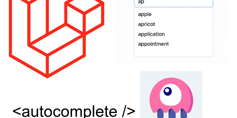
In this snippet we will build a searchable autocomplete or dropdown component in your laravel project with livewire and Alpinejs.
I tend to use autocomplete dropdowns in many of my projects as an alternative to native html <select> for picking big data. The most common of these is the jQuery Select2 library which is perfect when utilizing jquery in your project.
However when working with a livewire, you start to look for something adapted with livewire environment. This is why we will create this simple livewire component as an autocomplete.
Preparing The Component
Create a new livewire component:
php artisan livewire:make autocomplete
This component will encapsulate the autocomplete code.
Next open the component class located in Livewire/Autocomplete:
<?php

namespace App\Livewire;

use Livewire\Attributes\Reactive;
use Livewire\Component;

class Autocomplete extends Component
{
    public string $label;

    public string $query = '';

    #[Reactive]
    public array $list = [];

    public mixed $selected = null;


    public function render()
    {
        return view('livewire.autocomplete');
    }
}
I declared some public properties to be used in the component html. The $label property represent the component label, it will be passed to the component by the invoking component.
The $query property is the search term by the user, while the $list property is the list to search in, typically this will be passed by the other component who use the Autocomplete component. The $list property is marked as reactive with the Reactive attribute.
The $selected property represent the selected item from the list.
Now go to the component view, we will return back to the class again:
resources/views/livewire/autocomplete.blade.php:
<div
    x-data="{ open: false }"
    @click.outside="open = false"
    class="relative"
>
    <label class="block mb-2 text-sm font-medium dark:text-white">{{$label}}</label>

    {{-- Search Input --}}
    <input
        type="text"
        x-on:focus="open = true"
        wire:model.live.debounce.150ms="query"
        class="py-2.5 sm:py-3 px-4 block w-full border border-gray-200 rounded-lg sm:text-sm focus:border-blue-500 focus:ring-blue-500 disabled:opacity-50 disabled:pointer-events-none dark:bg-neutral-900 dark:border-neutral-700 dark:text-neutral-400 dark:placeholder-neutral-500 dark:focus:ring-neutral-600"
        placeholder="Start typing..."
    >

    {{-- Dropdown --}}
    <div
        x-show="open && $wire.list.length > 0"
        x-transition
        class="absolute left-0 right-0 mt-2 bg-white border rounded-lg shadow-lg z-20 max-h-60 overflow-y-auto"
    >
        @foreach($list as $item)
            <div
                wire:key="item-{{ $item['id'] }}"
                class="px-4 py-2 hover:bg-gray-100 cursor-pointer"
                wire:click="selectItem({{ $item['id'] }})"
                x-on:click="open = false"
            >
                <div class="font-medium">{{ $item['name'] }}</div>
            </div>
        @endforeach
    </div>

    {{-- Clear Button --}}
    @if($selected)
        <button
            wire:click="clearSelection"
            type="button"
            class="text-xs text-red-600 mt-1 hover:underline"
        >
            <svg xmlns="http://www.w3.org/2000/svg" fill="none" viewBox="0 0 24 24" stroke-width="1.5" stroke="currentColor" class="size-3 inline">
                <path stroke-linecap="round" stroke-linejoin="round" d="M6 18 18 6M6 6l12 12" />
            </svg> <span>Clear selection</span>
        </button>
    @endif

</div>
The autocomplete html styled using tailwindcss classes. The component wrapper <div> is assigned an Alpine x-data directive which declares the open property:
x-data="{ open: false }"
The open property indicates whether to toggle showing the autocomplete list when user focus and start typing in the input.
Next we display the autocomplete custom label using the $label public property from the class:
<label class="block mb-2 text-sm font-medium dark:text-white">{{$label}}</label>
In the <input /> tag, this where the user types in the search term. I bind the query property using wire:model and listen for the focus event using the x-on directive:
<input
        type="text"
        x-on:focus="open = true"
        wire:model.live.debounce.150ms="query"
    />
Next the dropdown list is wrapped as a <div> with classes “absolute left-0 right-0” so that to position the element as absolute relative to the parent div:
    <div
        x-show="open && $wire.list.length > 0"
        x-transition
        class="absolute left-0 right-0 ...."
 ...
</div>
Also we show the list when the open flag is true and count list of items greater than 0.
To display the items we use a @foreach loop over the $list property and display each item:
@foreach($list as $item)
            <div
                wire:key="item-{{ $item['id'] }}"
                class="px-4 py-2 hover:bg-gray-100 cursor-pointer"
                wire:click="selectItem({{ $item['id'] }})"
                x-on:click="open = false"
            >
....
@endforeach
When select any of the items the selectItem() method is called, we will create below in the class.
Finally we display a clear button when an item is selected:
@if($selected)
        <button
            wire:click="clearSelection"
            type="button"
            class="text-xs text-red-600 mt-1 hover:underline"
        >

    ....

</button>
    @endif
Now let’s return to the component class and add the missing class methods. Add these methods before the render() method of the component:
public function updatedQuery()
    {
        if(strlen($this->query) < 2) {
            $this->dispatch("clear-selection");
            return;
        }

        $this->dispatch("search", $this->query);
    }

    public function selectItem($id)
    {
        $this->selected = $id;

        $item = array_find($this->list, fn($item) => $item['id'] == $this->selected);

        $this->query = $item['name'];

        $this->dispatch("select-item", $item);
    }

    public function clearSelection()
    {
        $this->selected = null;

        $this->query = '';

        $this->dispatch("clear-selection");
    }
The updatedQuery() method is triggered when user start typing into the input field, and in this case if the length of the search query less than 2 then we dispatch the custom event “clear-selection“, otherwise we dispatch the event “search” with the search term.
The selectItem() method i mentioned above in the view is called when any item in the list is selected. It access the item id and uses the php array_find() function to retrieve the item from the list and then dispatch a custom event “select-item” with the item.
Note that the array_find() function is a new array function released with PHP 8.4.
The final method is clearSelection() which invoked when we hit the clear selection button in the view, and all it does is reset the $query and $selected variables and also dispatch the event “clear-selection“.
Using The Component
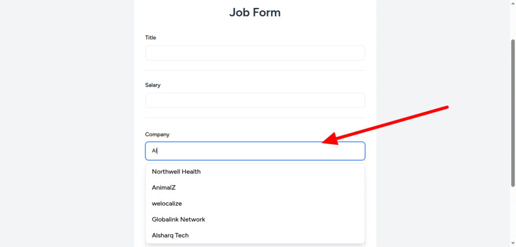
To demonstrate the usage of the component, i created a simple job form where user can post the job info like title, salary, select company, and job description as in the figure:
In the job form view typically we call the autocomplete component using the <livewire /> tag like so:
<div class="mt-2 space-y-3">
                    <livewire:autocomplete label="Company" :list="$companies" />
                </div>
Most of the code is omitted for simplicity. As shown i passed the :label and :list props. The :list prop assigned a public property $companies which is declared in the form class.
In the job form class Livewire/JobForm:
class JobsForm extends Component
{
    ....

    public $companyId = null;

    public $companies = [];


    #[On('search')]
    public function onFilterCompanies($query)
    {
        $this->companies = Company::query()
            ->select("id", "name")
            ->whereLike("name", '%' . $query . '%')
            ->limit(5)
            ->get()->map(fn($item) => ['id' => $item->id, 'name' => $item->name])->toArray();
    }

    #[On('select-item')]
    public function onSelectCompany($data)
    {
        if($data) {
            $this->companyId = $data["id"];
        }
    }

    #[On('clear-selection')]
    public function onClearCompanies()
    {
        $this->companies = [];

        $this->companyId = null;
    }

    public function render()
    {
         .....
    }

}
In this class we declared the list of items passed to the autocomplete component which is the $companies property, and we added the listeners that triggered on search, on select-item and on clear-selection using livewire #[On()] attribute.
The onFilterCompanies() method is triggered on start typing on the autocomplete which receives a parameter $query. And we do an eloquent query to search in the companies and then map the results into an array have the id and name like so:
#[On('search')]
    public function onFilterCompanies($query)
    {
        $this->companies = Company::query()
            ->select("id", "name")
            ->whereLike("name", '%' . $query . '%')
            ->limit(5)
            ->get()->map(fn($item) => ['id' => $item->id, 'name' => $item->name])->toArray();
    }
The onSelectCompany() method is invoked when “select-item” custom event is triggered using #[on('select-item')] and also receives the selected item which we assign to $companyId property.
And finally when the “clear-selection” custom event is triggered we call the onClearCompanies() method which clear both of companyId and the list $companies.
The full source code of this snippet is in the Repository link below.